The Bitcoin Power Law Model

TL;DR
The Bitcoin Power Law model isn’t new but has gained renewed attention in recent months. It has been holding up well and is easy to use. Contrary to common log-linear plots, the Bitcoin Power Law utilizes logarithmic scales on both the x-axis and y-axis. This way of plotting strips away day-to-day volatility and reveals an interesting relation between price increase and time increase.
It’s remarkable that BTC seems to obey a direct relationship between the variables price and time – but only after you strip away the noise of the day-to-day volatility. And that’s what the power law corridor model does: it uses logarithmic scales to plot the price and the time.
Number of days go up -> Price go up. But what’s the relation exactly? Before we dive in, let’s first look at some more well-known competitor models.
Competitors
There are two main competitors to the Power Law Model: The Stock-to-flow Model and Rainbow Chart.
Stock-to-flow Model
The stock-to-flow model was all the rage in the previous bull market. Created in 2019 by pseudonymous Dutch financial analyst PlanB, it seemed to have predicted the Bitcoin price reasonably well. When the bear market unfolded in earnest, the model didn’t look so good anymore: price has been deviating a lot from the projected price. This is not to say it isn’t directionally right or couldn’t be redeemed.
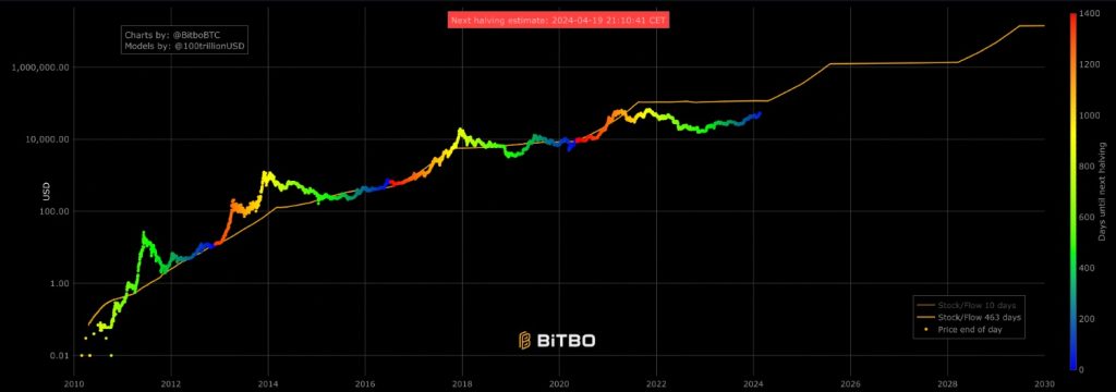
The stock-to-flow model posits that the price of Bitcoin is directly influenced by its scarcity, which is defined by the stock-to-flow ratio. The stock-to-flow model implicitly assumes that demand for Bitcoin will remain consistent. It does not account for fluctuations in demand due to for example regulatory changes or shifts in investor sentiment. It also doesn’t take into account that the supply shock that is each halving will become less and less important in both absolute and relative terms.
Also, the model is set up in such a way that it almost HAS to break at some point. Or is it even remotely likely that BTC will reach a price of 250 billion dollars in 2045?
Rainbow Chart
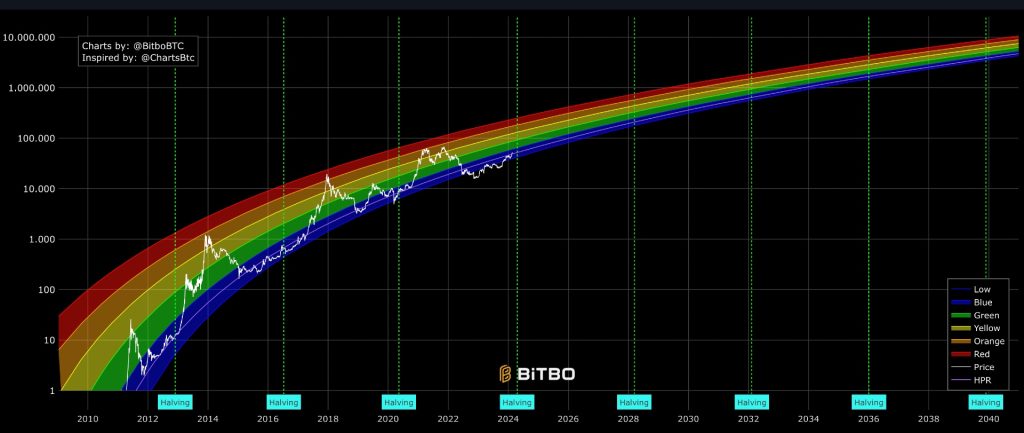
The Rainbow Chart is a logarithmic regression model. Log-Linear Regression. In this case, the y-axis (BTC price) is log-transformed. This means that each step up means a 10x in price. This compresses the y-axis, which is crucial in the case of BTC. You could not plot its spectacular growth on a linear scale and still accurately read the price points across all time.
The rainbow chart uses multiple colored bands to represent different price levels of Bitcoin over time. Each color band typically corresponds to a sentiment or market behavior, ranging from Red (“Maximum Bubble Territory”) to Dark Blue (“Basically a Fire Sale”).
The idea is that Bitcoin’s price tends to return to the regression line over time, so prices significantly above or below the line are seen as unsustainable in the long term.
The Power Law Model for Bitcoin
Ok, so let’s jump into the model under discussion, originally proposed in this Reddit post by Giovanni Santostasi (on X). he and a co-author updated the model in 2024.
We all know that Bitcoin’s price increase is not linear. Just to illustrate this: it took the Orange Coin roughly a year, in 2011, to move from 1 dollar to 5 dollars. Extrapolating this trend of 4 dollars per year linearly would bring us at a current price of around 50 dollars. Nope…
Clearly, BTC advances faster than linearly. So, exponentially, then? What if we’d extrapolate the 5x in price in 2011 twelve times over (2012-2024)? Putting this in an exponent calculator gives us a current BTC price of 240 million dollars. That’s overshooting it a bit…
We already know that BTC is not exponential by looking at the above rainbow chart.
An exponential price growth would have looked linear in a log-linear chart, where we take the log of the y-axis but leave the x-axis linear. The log of the y-axis sort of cancels the exponential and makes it look linear. But that’s not the case.
So, the relation is not exponential. And this is what already seems to invalidate the stock-to-flow model. This model is based on the exponentially (exponent of 2) decreasing supply of Bitcoin after every halving, and the corresponding exponential price growth – which hasn’t happened in recent years.
If we look carefully at BTC’s price we see the following:
BTC’s growth in price by an order of magnitude requires an equivalent (though not identical) change in orders of magnitude of time.
Ok, without further ado, let’s show the darn chart.
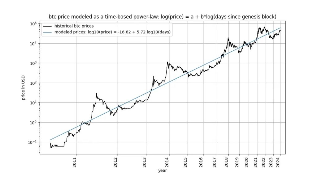
What we see is a price that hovers around a sloping but straight line. On the y-axis, we see a 10x every step up and on the x-axis we see time pass ever faster, so to speak.
So, the chart is not a log-linear plot like the above stock-to-flow and rainbow charts. Instead, it’s a log-log plot. We only get a straight line when both axes are plotted logarithmically. When you see a linear trend in a log-log chart you know you are dealing with a power law, not an exponential.
Which is another way to say the following:
It will take the BTC price an ever longer amount of time to do another 10x.
Intermezzo: Power Law Charts in Other Domains
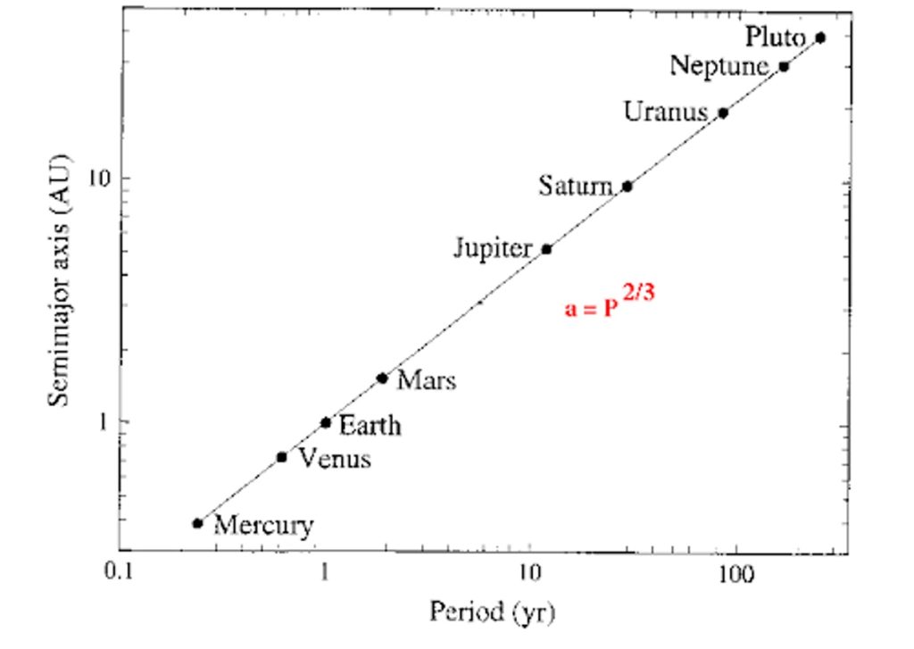
The power law chart has for centuries been of help to understanding a wide range of natural phenomena. Astronomer Kepler used it to predict the time of orbit of any newly discovered planet as derived from its distance to the sun.
The orbital period squared divided by semimajor axis cubed is constant for all planets. (The semimajor axis is half of the longest diameter of an ellipse: planets’ orbits aren’t circular but elliptical).
This is Kepler’s third law of planetary motions.
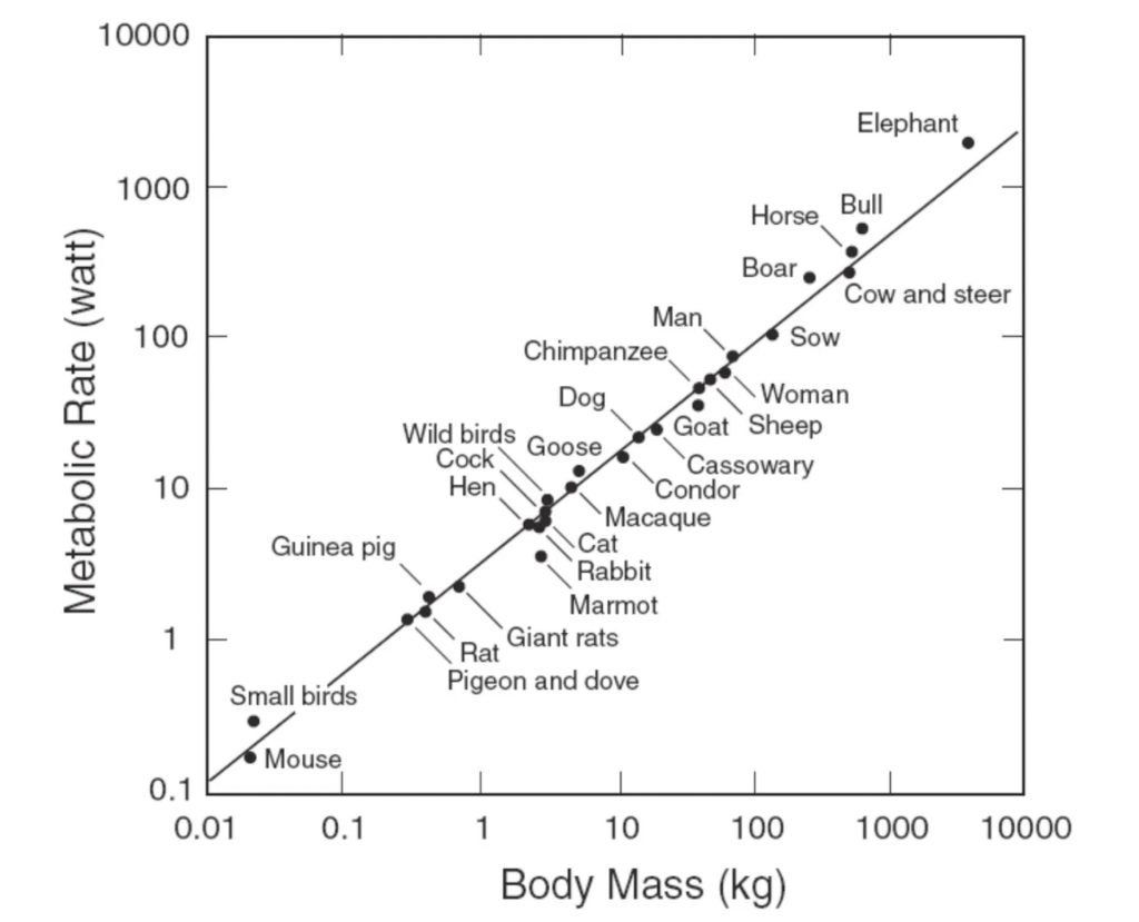
And below is the power law relation between any animal’s body mass and its metabolic rate. It shows (roughly) that for 10 times heavier animals, the metabolic rate also goes up – but with less than a factor of 10.
This Kepler power law chart addresses an objection sometimes heard against the Power Law model for BTC, namely that it makes no sense to plot time on a log scale. The counterargument is that this has been done since the very beginning of log-log plots, as shown in Kepler’s plot.
Price Predictions
So, back to the BTC Power Law model. We already saw that the number goes up, with diminishing returns over time.
More precisely, for the price to increase 10-fold, the amount of time elapsed from the Genesis block must increase by about 50%. This means that in relative terms, 10x price increases happen at a constant rate. But in absolute terms, you’ll have to wait longer and longer for a 10x.
What does the power law model predict? Well, the ‘fair’ average value for BTC would reach 1 million dollars around 2033. By that time, the bear market bottom (the red line) would be well over 300,000 dollars.
More in general, we see the following:
- Continued, but slowing growth of the price of BTC
- Reduced, but still large volatility in the future
- No guaranteed price rise within a four-year period.
Let’s zoom in on the latter point.
Until now, each four-year halving period had a bubble whose price was exceeded by the next period’s bubble. Due to the above point of slowing growth and corridor width, this is not guaranteed to continue to be the case in the future. As an example, the model allows for (doesn’t predict it per se) the following scenario:
- A blow-off top price of about $385,000 at the beginning of 2025
- A price that is lower than $385,000 until 2033.
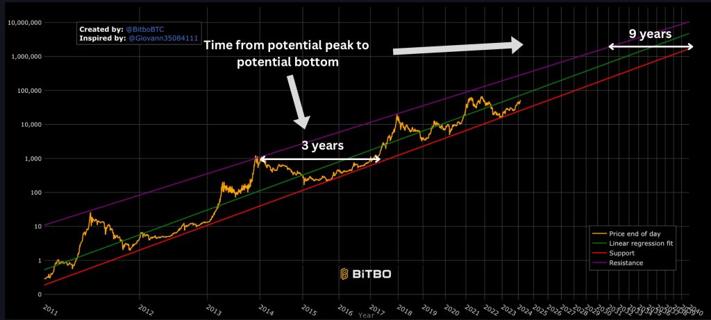
Buying at the top around 1,000 around the end of 2013, you would have had to wait a little over three years of bear market before you would have broken even – not nearly as long as you might have to wait in the future to break even.
Other Assets, not a Power Law?
According to the creator of this model:
“I never saw a chart that showed clearly this power law behavior.”
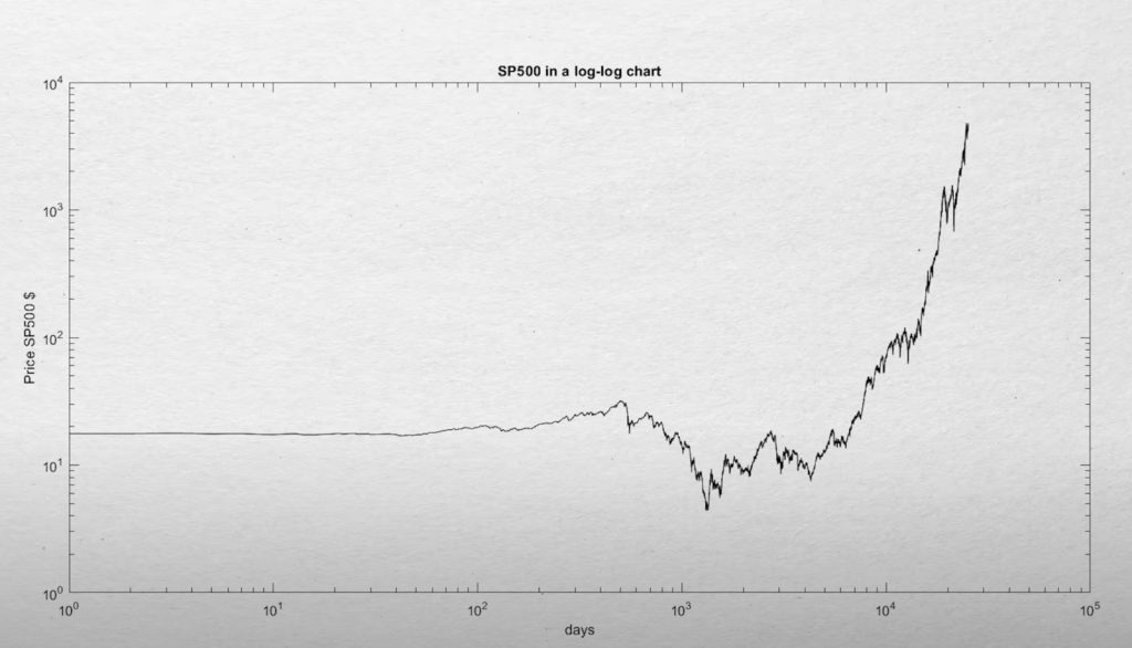
Is this really so? Could one not draw a line on a log-log chart through just about any set of data points, like with the gold price or the stock market index prices?
Well, here’s the S&P 500 over a 70-year period on a log-log scale: no straight line. Also for the gold price, it can’t be done, according to the author.
“I think there are a lot of people out there, like me, that are just looking to diversify their way out of a broken fiat system. […] It’s a really big idea — and my brain is really small — which is why it has taken me this long to wrap my head around it. But, as they say, “once you see it, you can’t unsee it”.
Crypto is indeed a ‘really big idea’ and wrapping your head around this is hard. It doesn’t suit everyone’s temperament to be pulled into a new paradigm. And the first major roadblock obscuring that new paradigm and distracting from it, are the pumps and dumps and Lambo’s. It’s as if the truth is hidden from view by a huge circus (in this sense it’s not unlike a lot of religions, where you will find a lot of symbolism and seemingly nonsensical behavior covering the religious dogmas).
So, does this mean Bitcoin indeed is super unique, that other assets cannot be plotted on such a chart?
Not quite. Here’s altcoin Kaspa since its genesis: it’s a power law chart as well!

This suggests that power law charts could apply to new assets that find increasing adoption. Bitcoin is the first of such assets, at least in our lifetime. Maybe, if you could find a 5,000-year price chart for gold, you would find a power law as well: it’s just that we don’t have the data.
The Kaspa example makes us aware of an important warning. Do we expect any power law to hold indefinitely? Do we believe Kaspa is still around in 20 years, on the same trajectory? Not so sure. So, while Bitcoin’s longevity prospects are no doubt higher than Kaspa’s, there’s no guarantee that it will still move on along the same trajectory indefinitely.
Conclusion
The Bitcoin Power Law Model has held up remarkably well over an enormous price range from cents to tens of thousands of dollars. It offers a nice lens through which to view Bitcoin’s price trajectory. It doesn’t make complicated assumptions about what drives the price: it simply highlights the time-based dynamics of the price. While it faces criticisms and challenges, its modest and descriptive approach gives us a compelling tool to zoom out from daily candles and chill.

